Brother Anthony Sweere, FBP, has been creating Russian-style icons for churches while studying under master iconographer Vladislav Andreev. He has written icons of St. Peter and St. Paul for the side chapel of the Cathedral of St. Paul and worked with Andreev and others to write the icons covering the dome of the new church of St. Michael in St. Michael, Minn.
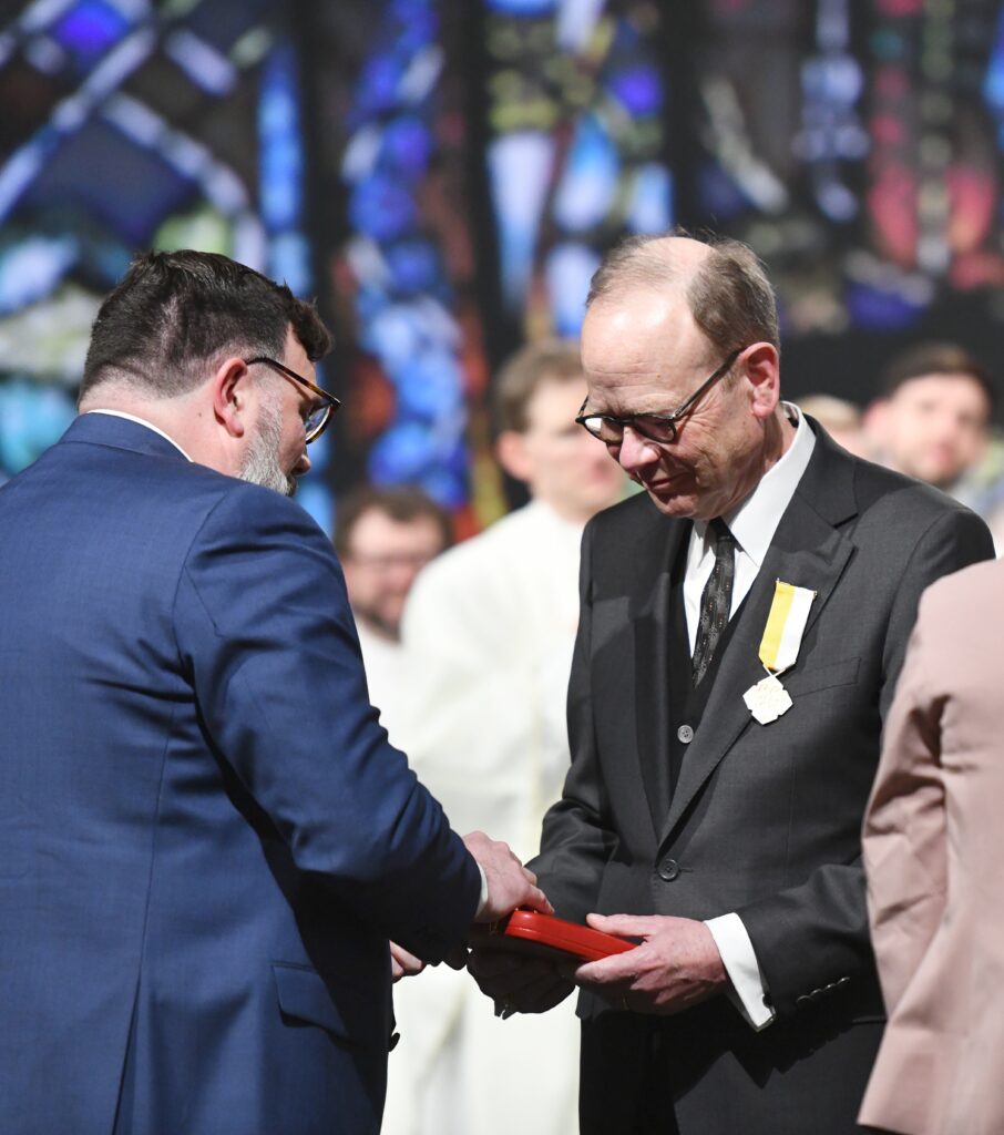
The first Center for Catholic Studies Habiger Artist in Residence, Sweere was commissioned to write an icon of Christ the Teacher for the center’s chapel. He also delivered a series of talks on the history, meaning and symbolism of icons, as well as on the icon writing process. Following are some excerpts from his presentations.
The ancient prohibitions against images of God were put in place because no one knew what God looked like. Of course, the image preexists before creation because the Logos, Jesus, is the perfect image of God the Father, and this is an eternal icon. So icons aren’t something invented by a human being who was clever.
In the old covenant, the Lord appeared in different forms. But there was no human face until the Incarnation. When the Logos took flesh and became a physical being, he consented to be described. So God allows us to make descriptions of God, verbally or pictorially.
The Greek work eikon means image. Any corporate logo, painting, statue — they’re all icons in the generic sense. But in the specific canonical sense, there is a distinction. When we see Christ, for instance, we see the Father, as he said. Or when we see a painting of Christ, we are seeing Christ. We are directing our love through that image to Christ, or to the Mother of God. The icon goes a step further; in the East, the icon is considered to function like a sacrament, a channel of grace. Icons are “windows into heaven.” The icon shows you, through an image, life at the throne of God; however, the life you are viewing is also viewing you.
The Church confesses the faith of Christ in words and image. The icon can be considered the counterpart, in image, to the word of the Gospel. The Second Council of Nicaea in 787 decreed that the icon is worthy of the same veneration we direct toward the Holy Gospels and the cross of Christ. When the Holy Gospel is cracked open, and those words are spoken, Christ becomes present. It’s not a different presence than that of the Eucharist; it’s a different mode of presence. We know the Blessed Sacrament is the most substantial presence of Christ in the physical universe. But that does not negate the fact that he is present in many other ways. The icon is one of these other modes of presence in which God comes to us.
The panel icon as it appears in the Russian tradition is the method I’m using to create the icon of Christ the Teacher. There are two mainstreams of iconography in the Eastern churches: the Greek Byzantine and the Russian Byzantine. I was always drawn to Russian icons because they are luminous, the colors are translucent, and they have a vibration that I don’t see in Greek icons.
The panel icon starts with a panel of nonresinous wood, cut with the grains vertical. It’s a symbol of the tree of life, the wood of the cross, and it has vertical lines indicating that this life comes from God above. This is an image used for meditation, and each step of the way there’s a meditation required of the iconographer, because this is a journey of prayer, patience and discipline. We don’t worry about the end result, but we hope God will bring about a beautiful end result.
Just as you have the cross, with vertical and horizontal bars, in the east the board of the panel icon is understood to be in some way a vertical expression of the light of God. The horizontal bar would be the life God gives to all creatures in the universe. So the board is not painted on an easel but kept horizontal to emphasize the idea of light and life.
The next step is what’s called the kovcheg, which means ark, as in the Ark of the Covenant. The panel is routed out, and it creates a frame, so it’s like a container, an ark. The frame symbolizes the old covenant. Jesus said, “I came not to abolish the law, but to fulfill the law.” Christ fulfills all things and transcends all things as well. So the image placed within this framework of the old law fills it and transcends it. That’s why the halo of the person goes beyond the frame. God will always transcend our understanding. And there’s always more that God wants to tell us than what we might perceive.
The next aspect of constructing the panel is soaking unrefined linen in animal skin glue. The linen is a symbol of the shroud. From a practical standpoint, the linen acts as a shock absorber, so that when the wood splits we’re hoping the image will ride along the linen and not split with the board. Once the linen is adhered to the panel, then we apply gesso to the linen to form a rigid foundation on which we can paint and apply clay for gilding. The gesso symbolizes the purity that God brings to a person’s life.
We have, then, the image. The sketch made of the subject matter is transferred to the icon and is linked to a word in God’s mind. We know the Logos became incarnate as Jesus Christ, but we also know God has other logoi, other words he speaks. The icon parallels this idea: a word is spoken in the mind of God, and that forms the sketch for the icon. This etching of the sketch into the gesso symbolizes the naming of God of this particular saint in our heart. So we have to pray for the intercession of the person being depicted in the icon through the course of the work.
Then red clay is added, which symbolizes our heart, also the material part of who we are. Just as vessels of clay need to be fired, so do we in our material aspect. Until the Holy Spirit comes into our life and fires us, we cannot contain the holy things, the presence of God. Because of the animal hide glues present in the clay, when you breathe on it from a very close distance with a very heavy, warm breath, it hearkens back to God breathing his spirit into Adam. So we breathe on the clay, and that opens the glues within the clay. Immediately we place thin sheets of gold leaf on the area that was breathed on, and the gold adheres permanently, symbolizing the divine spark.
Most icons have a light background, which symbolizes the light of the kingdom of God. It not only permeates everything but also comes from within the holy ones depicted. The icon does not have shadows in it but only gradations of light. The light in the background symbolizes the light of the kingdom.
We have about seven steps of color application in the icon, beginning from dark and moving to light. In Eastern tradition, when the soul is created, it’s like a sphere of light. So the first highlight put on the dark base layers of pigments creates rounded forms. The next highlight is a lighter color contrasting the layer just applied below. That layer facets the circular aspect of the soul, like a diamond, symbolizing the cutting away that God does to those parts of us that need to be purified. The third layer of highlight covers smaller areas, achieving very intense lines of light on the edges of the faceted areas. The fourth highlight is called a zhivki in Russian and means “life-giving lines.” Those take up a mere fraction of the total area of the icon, just the tiniest darts of light. If the icon is missing those, it’s not working as an icon. From a theological point of view, it indicates the uncreated light of God, his presence shining through the image.
In between these layers of pigment are translucent floats; we have to float the entire icon with a color that will unify the highlight we just put on with the layer below it. The final thing done is that the whites of the eyes and the white around the halo are put in. The red and white lines around the halo are called “crowning.” The red symbolizes alpha, the beginning of the cycle. The white means the omega, the completion of the cycle. Just as in our lives we have various cycles, the icon communicates the cycle of life. To top it off we anoint the icon. It’s symbolic of anointing a human person. The icon endures an anointing of the spirit and an enlivening that takes place liturgically. After it’s oiled, it will last for thousands of years.
The number one thing to understand about the icon is something called inverse perspective. The icon puts the vanishing point at our heart rather than off in the distance. In the icon the things farther away are larger, and things closer are smaller, to communicate that it is God revealing himself to us through his holy ones, through the feasts of the church. Those are the large things, the significant things, and in some ways we are very small. I’m not saying we are insignificant in God’s eyes, but rather, the priorities are straightened. This approach is a communication of humility.
In all icons, the heads are almost perfectly round. That is because you are viewing in an icon the total revelation of the person. If a person is in profile and you see only one eye, that person is in spiritual darkness, and you are not experiencing the total person. In the icon, if the person is a holy one, you see both eyes, and the head is completely round; you’re seeing not only the front of the face but the sides of the head and the back simultaneously.
For the icon of Christ the Teacher, the letters on either side of Christ look like ICXC, the Greek abbreviation for Jesus Christ. The hands are in a stylized position of blessing, depicting these letters with their fingers. The Gospel passage in the icon was picked to imply being taught: “Take my yoke upon you and learn of me, for I am meek and humble of heart.” It’s done in a Slavonic-Roman alphabet. Maybe at first we look at the Gospel book and say, “I can’t understand it.” Maybe there is something else you need to absorb, and as you sit with it, it will reveal itself, and you’ll be able to read it. Almost in the same way the Gospels do, icons at first hide some of their message from us. The truth is revealed, but it’s hidden within a veil. Over a lifetime of meditation we can assimilate the truths that are represented in the icon, just as reading the Gospels every day of our life brings something new to our attention.
Because the rules of the Church dictate how the icon looks, the icon is objective truth. It’s not the subjective truth of an artist; therefore, the iconographer cannot sign it. It’s really not ours. It’s called icon writing because it’s just like copying one of the Gospels, and we want to be faithful to the translation.
There’s a patristic saying: “We become that which we gaze upon.” That’s important in the media-soaked world we live in. This is particularly profound when you think about the Beatific Vision, looking upon the ineffable God when we depart this life. If we become that which we gaze upon, that means we will become like God through grace.